Telus Property Services + Solutions: A Rebrand That Communicates a Higher Level of Commitment and Service
More than a real estate services company, Telus Property Services + Solutions is a bold, customer-focused brand in the commercial property world. With a sharp eye for service, performance, and possibility, Telus brings a distinctive edge to a traditionally conventional industry.
A Rebrand Aligned with Purpose and Possibility
Telus Property Services + Solutions partnered with Christiansen Creative to uncover a name and descriptor that would reflect its evolving vision and impact. The goal: create a brand identity that reflects the company’s straightforward approach, broad capabilities, and readiness to lead in a competitive commercial real estate landscape.
Rather than a highly complex brand system, the Telus team needed a clear, focused brand that cuts through industry noise—something smart, simple, and visually memorable. The result is a bold new name and identity designed to help Telus make its mark.
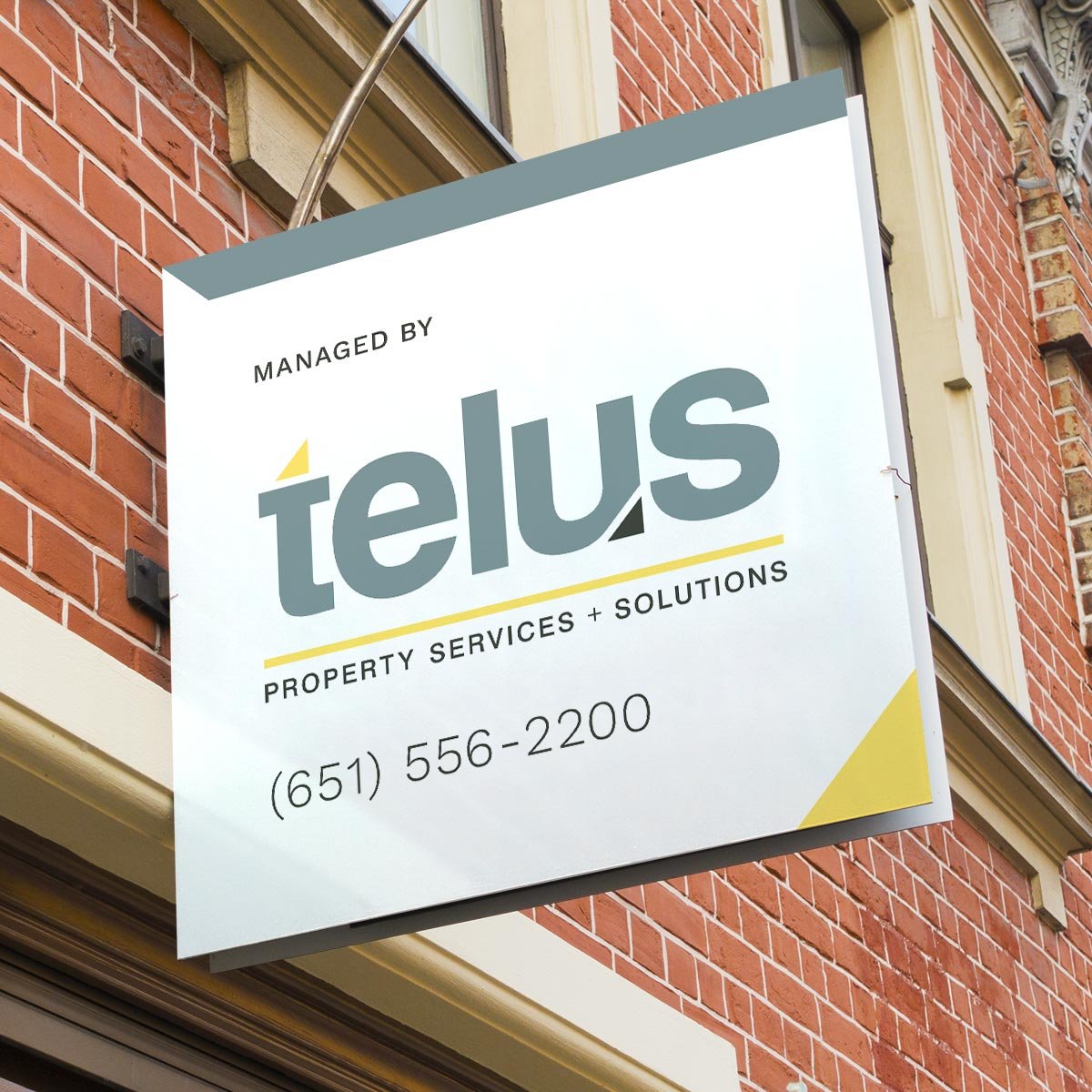
Deliverables & Strategic Branding Solutions
Name & Descriptor Development – Collaboratively uncovering a name and concise descriptor that reflects the company’s expanded services and straightforward nature.
Distinctive Visual Identity – A clean, striking look that sets Telus apart in the commercial real estate sector, signaling confidence and clarity.
Simple Brand Standards – A streamlined brand guide that equips internal teams to implement the identity with consistency, without over-complication.
Digital & Print Assets – A cohesive set of tools for everything from client communications to signage and online presence.
A Brand That Leads in Commercial Real Estate
The result? A smart, standout brand that reflects the ambition and clarity of Telus Property Services + Solutions. With a fresh name, a sharp visual identity, and a practical approach to brand standards, Telus is poised to grow its reputation as a trusted partner in commercial property services.
At Christiansen Creative, we help organizations find clarity and distinction through branding. Whether you’re evolving your name, creating a new identity, or rethinking how your brand shows up in the world—we’re here to help your brand lead with confidence.