Ampact: A Rebrand That Aligns Mission, Programs & Growth
Since launching its first education program in 2003, Ampact has evolved significantly—expanding its programs, services, and impact. Along with this growth came a need for a new brand identity that unified the organization’s expanding initiatives and reflected its vision for the future.
Strategic Rebrand for Cohesion & Scalability
With a new name and a growing family of programs, Ampact needed a brand that could seamlessly connect all of its initiatives under one strong, recognizable identity. Christiansen Creative developed a comprehensive branding system that provided clarity, flexibility, and consistency across all marketing, recruitment, and engagement efforts.
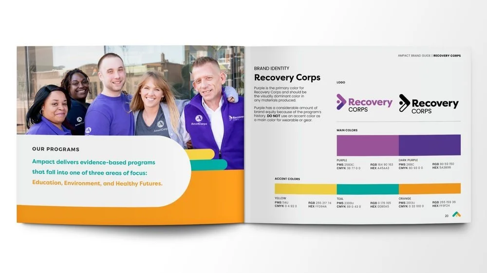
Logo System & Visual Identity
At the core of the Ampact rebrand is a bold, modern logo system designed for scalability and recognition:
The Ampact “A” was modified to include a forward-focused arrow, symbolizing progress, impact, and growth.
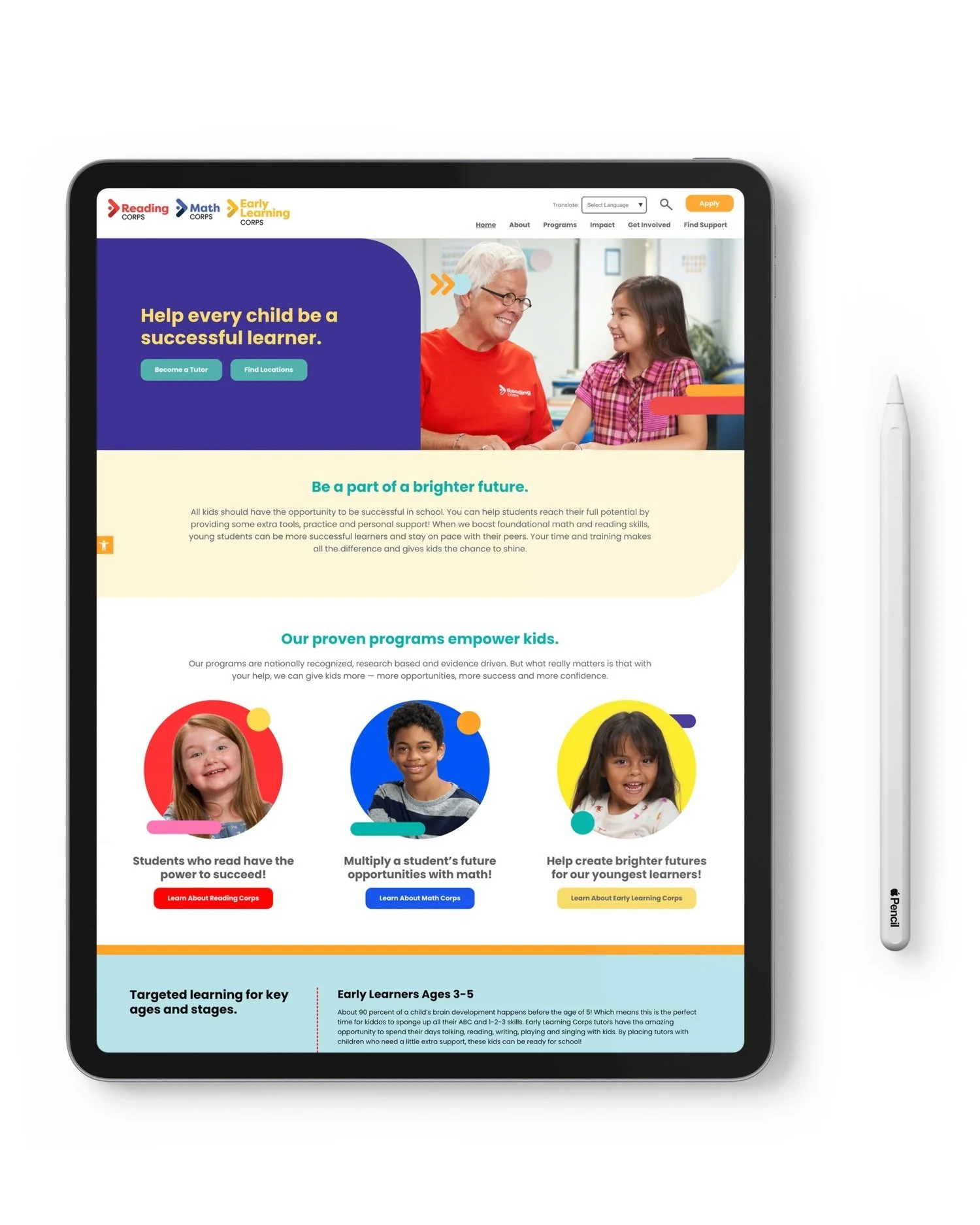
A consistent wordmark treatment connects the parent brand to its family of programs, ensuring visual cohesion while allowing each program to stand independently.
A scalable brand guide provides clear guidelines for logo applications, typography, color usage, and future brand extensions as Ampact continues to expand.
Deliverables & Implementation
To ensure a seamless rollout, Christiansen Creative provided a comprehensive suite of branding assets, including:
A detailed brand guide to maintain brand integrity across all platforms.
Social media assets designed to drive engagement and awareness.
Updated website design to align with the new brand identity.
A launch video to introduce the new brand to internal teams and stakeholders.
Interior brand graphics & identity materials for a cohesive brand presence across physical and digital spaces.
A Brand Built for the Future
The Ampact rebrand provides a solid foundation for future growth, ensuring the organization and its programs remain unified, recognizable, and impactful. With a scalable logo system, modernized identity, and strategic brand guide, Ampact is well-positioned to expand its reach and continue making a difference.
At Christiansen Creative, we specialize in branding that strengthens organizations and amplifies impact. Whether you need a brand refresh, a scalable identity system, or a full rebrand, we create strategic, future-focused solutions that help brands thrive.